
Hello my friends.
I'm sorry for the short supply of posts last week.
I had a crazy busy end of week...mostly because of workload...I'm currently in the middle of 10 projects and 4 painting commissions...it's a little insane...in the best possible way though:)
Also, I was out Thursday at this year's Interior Design Show, which because I'm old, meant Friday was a right off/recovery day...PS, being old sucks horse nuts.
What doesn't suck though is this...but let's back up a minute first...
As you know, we're re-doing the kitchen in #projectbistrochic and using IKEA Lidingo cabinets to do it.
And in case you had any doubts as to the magic that can be created from using IKEA cabinets in a kitchen renovation, behold their IDS14 booth, featuring our friend the Lidingo...


Is it just me or did IKEA go and create my dream home right before my eyes?
I mean holy hell...it's perfect.
And while I'm on them, look at the dressing room/bathroom areas they also whipped up...


SO freaking good.
Remind me come #projectdreamhouse time that a wall to wall glossy PAX built into the wall, is a must...also, not that I had any doubt, but slab marble as a backsplash...and large factory like windows...which brings me to those gold muttons...so next level pretty.
Inspiring to say the least.
After seeing this, I'm even more excited to see #projectbistrochic come to life.
And on that front, I've got a family room update of sorts.
To be honest, this room has been a real challenge...there were moments when I actually felt stumped...which is a craptastic feeling by the way.
The reason is that there are pieces my client really loves and wants to use, and though all stunningly beautiful in their own right, they're not necessarily easy things to make a cohesive scheme out of...mostly because of colour...basically, the palate is a gent I like to call, Tricky McTrickersons.
A quick summary...cobalt blue, black, orange and green in the artwork; a deep almost blood red Persian rug with accents or dark (almost black) blue; walls in F&B Hague Blue, sofa in grey, chairs and coffee table in black.
The conundrum has been how the heck to tie it all together...and by that I mean, what to upholster these bad boys in...

...along with what to put on the sofa in terms of pillows.
My client also wants to ensure that whatever we decide on, lightens the whole space up...so no dark blue backgrounds etc...oh and like me, she loves pink/lilac so wants that pulled in too.
You see my dilemma I suppose...a lot of colours that magically need to mold together....while still maintaining brightness...and prettiness.
No easy task my friends.
Without changing out the red rug, I was beginning to feel like I might not find the answer...and let me tell you, that felt VERY wrong...so the hunt continued.
You know how that goes...you just keep looking and looking knowing that somewhere out there, the perfect fabric or piece of furniture (that by the grace of the gods, makes everything gel together) is out there and by Holy Mother Mary, it's your place on this green earth of ours to find it.
Well, the good news my friends is that late last night, I finally found what I think is the answer by way of too divinely pretty Quadrille fabrics...
Exhibit A:

Le Notre Toile in Blue Rose...

{via}

{Bengal Bazaar and Riad pillows via}
Exhibit B:
Quadrille Macao 11...
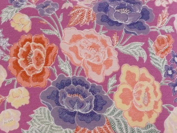
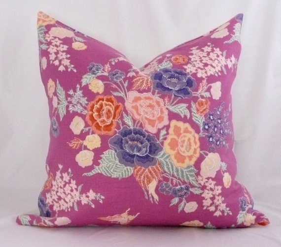
{via}

{showing this one as pillows because the cropped version of the pattern on the chairs just didn't reflect the pattern very well...imagine it as upholstery)
...which as evidenced by this room...


{via}
...also makes all of our colours work so beautifully.
So...to sum things up, I'm elated.
Like jumping up and down happy.
We now have two options that I think do just what I wanted them too...pull all the prettiness together into one chic and cohesive space.
Happy days my friends, happy days.
Now before I leave you...I'm curious...which one would you choose????
xo

wow those ikea cabinets look amazing! good luck with your projects. xo jillian - cornflake dreams
ReplyDeleteThey're both gorgeous fabrics (love how the entire room is coming together!), but something about the lighter one just grabs me. It pulls in all the colors without being too heavy against those gorgeous chairs and deep blue walls. Whatever you choose its going to look stellar!
ReplyDeleteThis beautiful post is full of luxe! Thank you for including our Motif Pillow.
ReplyDeleteThe Norte toile with its light background would be my choice. Such prettiness, can't wait to see the end result!
ReplyDeleteI think that second fabric looks fab as pillows upon a neutral linen upholstery. Lightens the place up and brings all the colors together!
ReplyDeleteEither option will look fab. I love the first option but something about option #2 sings to me. So glam.
ReplyDeleteI would choose option A, its really lovely - but wow those Black Rooster leather glove chairs in the pic - am in love with them!
ReplyDeleteGreat option but #2 speaks to me.
ReplyDeleteLove the design mock-up. Definitely option A for the fabric though. Option B is just a little too Laura Ashley meets Andy Warhol.
ReplyDeleteOption #2 but I see that I may be in the minority on that. La Notre Toile feels a little grandma to me ;), just a personal thing -I don't care for any "dusty" colors but you can probably prove me wrong! -Caitlin
ReplyDelete#2. They will never grow tired of it.
ReplyDeleteWow love the interior design of the homes. Especially the kitchen with crystal chandeliers and the room with a the hot pink oriental rug. And who wouldn't want a a remodeled bathroom made of gold. Very beautiful and all original.
ReplyDeleteSucks "horse nuts"is a term I've never heard, but let me just say, you are freaking hilarious and I love your genuine approach! Keep on keepin' on my friend!
ReplyDelete